I did not inherit this gene! I’m like some deranged museum curator – placing artwork enmasse on a wall. I’ll just keep adding until it feels right.
There are a few secrets to making a visually appealing wall collage, and I think I have it figured out. From my perspective, there must be one of the following: either a horizontal line that all pictures hang above or below, or a vertical line with pictures aligned to the left or right.
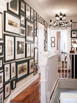
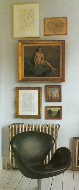
Designer Charlotte Moss gives the wall (above left) a casual, French asthetic, using an imaginary line just above the desk as her placement axis. In a similar way, the hallway gallery on the right (from Domino magazine) has a definite formal flare, taking its horizontal cue from the crown moulding.
Then, there are those galleries that seem to follow no rules for placement, but work perfectly by repeating a single design element.
At left, the aged, gold frames create a sense of harmony. Above, the black elements tie
all of the pictures together in a pleasing way. And, the best part of a less structured display - no measuring tape needed and you can hammer just one nail per picture!


0 comments:
Post a Comment